.png)

Heuristic Evaluation: The Weather Channel Mobile App
Wholistic evaluation of The Weather Channel app, from design to functionality.
The Ask
Even the most beloved apps have room for improvement. Identifying fundamental flaws with people's most favorite apps is difficult -- users grow accustomed to the structure and functionality of these platforms. To uncover the flaws of the popular Weather Channel Mobile App, I conducted a Heuristic Evaluation of Nielson's 10 Heuristics of User Interface Design.
HIGH LEVEL TIMELINE
1 week of preliminary research and use, 3 weeks for the evaluation
TOOLS
iPhone 8, The Weather Channel App for iPhone, Neilson's 10 Heuristics for User Interface Design
KEY GOAL
Identify opportunities for improvement on The Weather Channel App
MY ROLE
My role for this project was the evaluator. In this role, I familiarized myself with The Weather Channel App. Over the course of a week, I explored its functionality, did research on the product's history, and evaluated the interface as an unbiased user.
The Evaluation
I scored each of the 10 Heuristics on a scale from poor, average, to excellent.
I combed through the entirety of the app and noted where each heuristic is or should be addressed.
SCORING RUBRIC
Poor: the heuristic is not optimally addressed by the product and creates a negative experience for the user
Average: the heuristic's presence in the product is neutral and does not hinder or benefit the user experience
Excellent: the heuristic is successfully implemented into the design of the roduct and contributes to an exceptional user experience
Visibility of System Status
It is crucial that apps like The Weather Channel have a strong visibility of the system status so users are confident that the information is accurate. When the app is opened, the launch page features a rotating loading graphic to convey that it is loading and updating the content. When I asked a peer to log into the app on her phone, she immediately recognized that “it is obvious that it’s loading.” She continued by saying “the app is definitely more reliable knowing that it updates every time it reopens.” In addition to the startup loading icon, the home dashboard can be swiped down to refresh the content. Upon swiping, a message at the top of the screen reveals the last updates by saying "Updated about 10 seconds ago." These features give users a sufficient visibility of the system status.
.png)
Match Between the System and the Real World
The Weather Channel successfully makes their content understandable and relatable for all users by using real-world language and visualizations. For example, on my home page underneath the current weather, it tells me that the sky is “Generally clear. Low 38F. Wind WSW at 5 to 10 mph.” The app successfully "speaks the language of the target user base” making it universally accessible. They also use visualizations like rainclouds and sun rays to display the weather. This matches the real-world, universal representation of the weather outside.

Recognition rather than recall
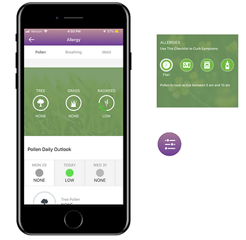
The app does not meet this heuristic because there is so much functionality that makes it difficult to remember the information structure. There are many screens that take some digging to find. This format does not support recognition, but instead, trial and error navigation, which is not efficient for the user. One of the screens that is tucked away is the Allergy information page. From the main dashboard to the Allergy page, it takes 6 clicks to land here. Since it is not recognizable from the main home page that this page exists, it is hard to remember how to get there in a pinch. This heuristic also refers to the ability of visuals to be clear in their meaning and function. The app's multitude of various buttons with unclear imagery does not support recognition. As a user, it is overwhelming to remember where to find and how to use all of the available tools.
Aesthetic and minimalist design
The Weather Channel follows the basic design principles of digital app design. The interface has sufficient white space, there is consistency in font and typeface, and the color scheme is fresh and clean. However, some minimalist design requirements are broken. For instance, the gradient uses two very contrasting colors, which does not support text and background contrast. The app also incorporates an excessive amount of colors, while best practice is to use a limited amount. The app is sleek and visually pleasing, however, there are improvements that can be make to make it even more minimalist.

Findings and Score
This Heuristic Evaluation scores The Weather Channel app user experience as average. It adheres to some Heuristics well, but does not sufficiently meet all 10.
While the app is structurally sound and informative, there are areas for improvement. Specifically, it excels in error prevention and matching to the real world, however, the complex iconography decreases recognition and there are layers of navigation that decrease the ease of use. This app is one with a great reputation and trustworthy facts, and satisfies the basic needs of users. However, taking a few extra steps to elevate the experience would create an even more efficient and desirable user experience.
Replace ambiguous icons
The icons previously identified with ambiguous graphics should be replaced to better reflect the action they afford. This will create a more efficient experience for the user and enhance efficiency of use.
Simplify visualizations
The weather data should be simplified so it is quickly understandable. Specifically, the line in the main menu hourly weather chart can be removed to minimize noise in that visualization. In addition, they can decrease color variability and mixing in the visualizations to keep them as straight forward and clean as possible.
Increase findability
With so much functionality, the information structure of the app needs to be more obvious to the user so they can navigate more efficiently. Findability can be enhanced with drop downs and other many features so users can identify the location of the information that they need.
Recommendations
2020 Update:
Version 11.17
My recommendations are reflected in the app's latest update
.png)
Since this heuristic evaluation of version 10.11.0 in 2018, The Weather Channel has had numerous updates and is now on version 11.17 (as of 7/20). The latest version aligns with the recommendations that I came up with. The complex information structure was simplified and a lot of the functionality was eliminated. This enhanced the findability and efficiency of use of the app. Along with this functionality, the ambiguous buttons were also removed. Now, there is a limited set of components that enforces recognition rather than recall and consistency and system standards.